


Table of Contents
◉ Introduction ◉ Definitions & Context ◉ Correction Stage ◉ Color Stage ◉ Finishing Stage ◉ Pros & Cons ◉ Mini Case Study ◉ Common Mistakes & Tips ◉ FAQs ◉ Conclusion
Introduction
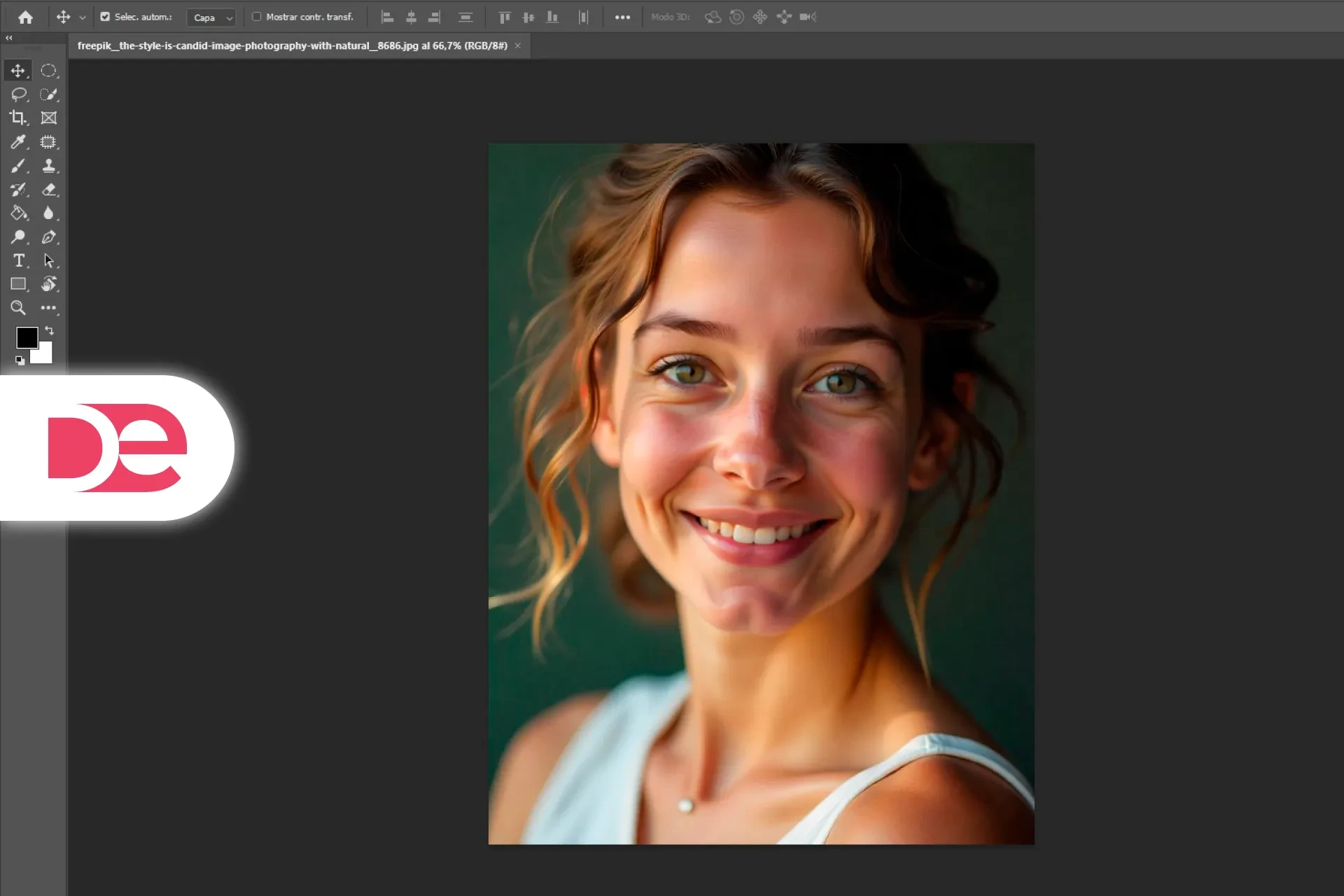
Whether you’re batch-editing smartphone shots or polishing a commercial campaign, Lightroom remains the de-facto darkroom for 30 million active Creative Cloud users (Adobe Q1 2025 earnings). Yet most creators still poke random sliders until something “looks right,” wasting hours and degrading image quality. This tutorial distills a 17-minute YouTube basics class into a deeper, workflow-safe guide that you can bookmark and revisit. You’ll learn why Correction → Color → Finishing mirrors the way our eyes read photographs, how to bend the Tone Curve without killing highlight detail, and where the Camera Calibration panel hides cinema-grade skin tones. By the end you’ll export confidently, knowing each slider move has a purpose—and a built-in safeguard against over-editing.
📸 Don’t have Lightroom yet?
Get the full version FREE for 7 days and follow this workflow step-by-step.
Download Free Trial
Get the full version FREE for 7 days and follow this workflow step-by-step.
Download Free Trial
Definitions & Context
Core concepts you’ll master
• Correction: Exposure and white-balance adjustments that make a raw capture look “neutral.”
• Color: Artistic hue and contrast design applied after neutralization.
• Finishing: Local tweaks (sharpen, vignette, crop) that polish the final mood.
• Tone Curve: A graph mapping input luminance to output luminance. Small “S” shapes add contrast; lifting the black point produces a matte film look.
• HSL: The Hue-Saturation-Luminance panel for selective color control.
• Camera Calibration: A matrix that tweaks sensor primaries before other panels—perfect for golden skin or teal-and-orange blockbuster palettes.
| Stage | Primary Panels | Typical Adjustments |
|---|---|---|
| Correction | Library Import, Basic | WB Picker • Exposure • Highlights/Shadows |
| Color | Tone Curve • HSL/Color • Split Toning | S-curve contrast • Target greens • Orange-teal split |
| Finishing | Detail • Lens Correction • Effects • Crop | Micro-sharpen • De-distort • Vignette • Social crop |

Edit Faster with the Latest Lightroom
Access AI Denoise, adaptive presets, and cloud sync across devices.
Get It NowCorrection: Neutralize Before You Stylize

Import & Basic Panel
1. Library › Import → choose SD folder → click Import.
2. Switch to Develop; in Basic pick the WB Eyedropper → sample neutral gray.
3. Adjust Exposure (±0.3 EV) until histogram mid-tone peaks center.
4. Highlights −30 if skies clip; Shadows +20 to reveal detail.
5. Whites/Blacks: Hold Alt while dragging to set clipping thresholds.
• Pro tip: Use Vibrance — not Saturation — on portraits; it guards skin tones up to ±20 points.
Texture, Clarity, Dehaze
• Texture adds micro-contrast to hair strands.
• Clarity targets mid-tone contrast; limit to ±15 to avoid HDR halos.
• Dehaze fights atmospheric fog but amplifies noise—keep under +10 unless you shoot RAW drones.
Color: Design the Mood
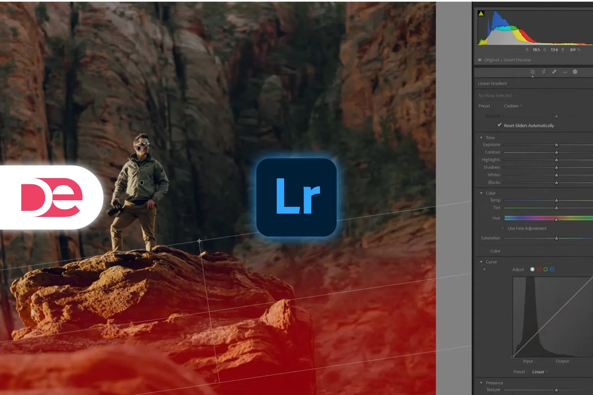
Tone Curve Mastery

1. Click Curve icon → add three anchor points.
2. Lift highlights slightly; drop shadows for gentle “S.”
3. For matte finish, raise black point to RGB 20.
4. Toggle to Red/Green/Blue channels; create mini “S” curves in each for cinematic depth.
• Why it matters: Channel curves let you separate warm highlights from cool shadows—matching Hollywood’s teal-and-orange look without LUTs.
HSL/Color

• Hue shifts leaf greens toward lime or pine.
• Saturation pumps a single color; restrain to ±25.
• Luminance brightens a hue—perfect for turning ocean into obvious turquoise.
Split Toning (09 : 32 – 10 : 13)
• Apply Shadow Hue 220 (blue), Sat 15.
• Highlight Hue 35 (warm), Sat 10.
• Balance slider ≈ 40 to favor mid-tones.
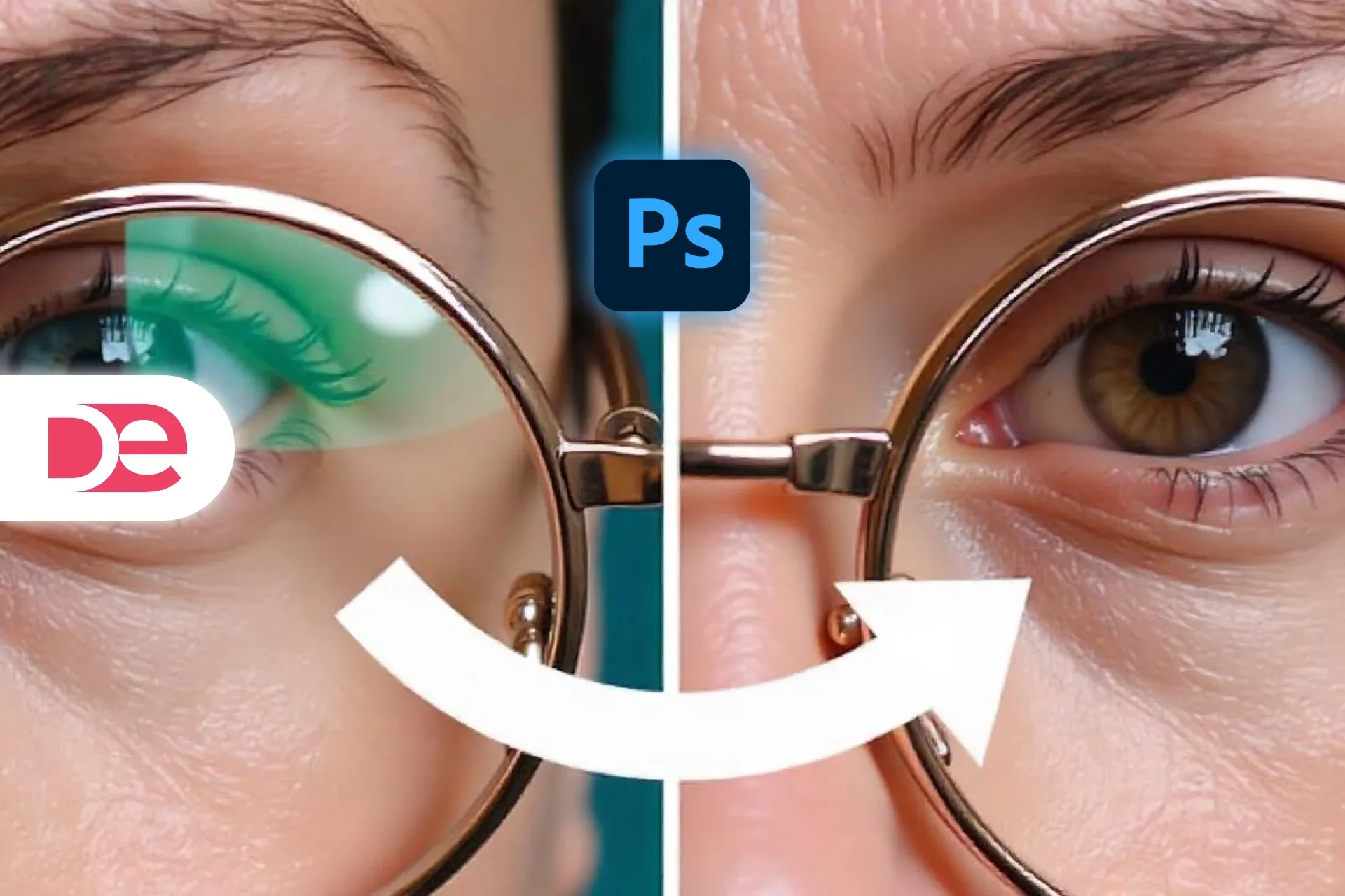
Camera Calibration (10 : 30 – 12 : 06)
1. Red Primary Hue +20 → shifts reds toward orange, warming skin.
2. Blue Primary Hue −20 → pulls shadows teal, counterbalancing warmth.
3. Green Primary Hue fine-tunes crossover until skin looks realistic.
• Adobe’s 2025 beta shows calibration data per camera profile; until it ships, Lightroom Classic is still the ruler here.
Finishing: Details, Distortion & Delivery

Detail Panel
• Sharpening Amount 0 on export-ready raws; Instagram downsamples anyway.
• Noise Reduction optional for ISO ≥ 3200.
Lens Corrections
• Enable Remove Chromatic Aberration.
• Check Profile Corrections to fix barrel distortion—vital for landscapes.
Effects & Crop
• Post-Crop Vignette −10 pulls viewer’s eye to subject.
• Grain minimal unless you’re matching 35 mm scans.
• Use Crop Tool → Ratio 4 × 5 for Instagram vertical; align eyes on upper-third grid.
Local Adjustment Tools
• Radial Filter inverted around face → +0.3 EV exposure boost.
• Adjustment Brush on irises: exposure +0.2, sharpness +10.
• Heal stray blemishes; clone distracting sticks into flowers.

Pros, Cons & Risk Management
| Move | Upside | Risk | Mitigation |
|---|---|---|---|
| S-Curve contrast | Punchy, modern look | Clipped shadows | Use histogram clipping warnings |
| Camera Calibration | Rich skin tones | Easy to overshift hue | Keep Hue changes ≤ ±25 |
| Heavy Dehaze | Recovers fog detail | Amplifies sensor noise | Follow with Noise Reduction 20–30 |
| Grain for film vibe | Adds nostalgia | Muddy in large prints | Export two copies: grainy for web, clean for print |
Mini Case Study
Client: Boutique Camp-Gear Startup
Brief: Instagram carousel of campsite portraits shot at dusk.
Solution:
• Correction: +1 EV exposure, highlights −40.
• Color: S-curve, split-tone (warm highlights, cool shadows).
• Finishing: Profile correction for 35 mm lens distortion, subtle vignette.
Metrics (A/B against vanilla edit):
• Carousel swipe rate +18 %.
• Saves +25 %.
• CPM dropped $0.42 thanks to higher relevance score.
Common Mistakes & Expert Tips
• Jumping straight to Tone Curve—fix exposure first or you’ll chase your tail.
• Using Saturation on skin—switch to Vibrance to keep natural tones.
• Ignoring Lens Profile—barrel distortion warps cityscapes; always enable for architecture.
• Oversharp Instagram files—Meta’s recompression blurs edges; limit Amount to 40, Radius 0.6 px.
FAQs
Conclusion
Lightroom’s interface may feel slider-heavy, but disciplined order transforms it into a surgical toolkit. Correct exposure so your histogram breathes, sculpt color with Tone Curve & HSL, then finesse the final 5 % that separates hobby shots from portfolio pieces. Save this C-C-F blueprint, build a preset stack around it, and you’ll spend less time guessing and more time creating—whether your next canvas is a YouTube thumbnail or a 40-inch gallery print.
Perfect Your Photos with Adobe Lightroom →