


Table of Contents
◉ Introduction ◉ What You’re Making (and Why It Works) ◉ Definitions & Context ◉ Step-by-Step Workflow ◉ Pros, Cons & Risk Management ◉ Practical Example (Banner Hero) ◉ Common Mistakes & Expert Fixes ◉ One-Page Reference (Table) ◉ Advanced Tips ◉ Mini Case Study ◉ Troubleshooting Guide ◉ FAQs ◉ Conclusion
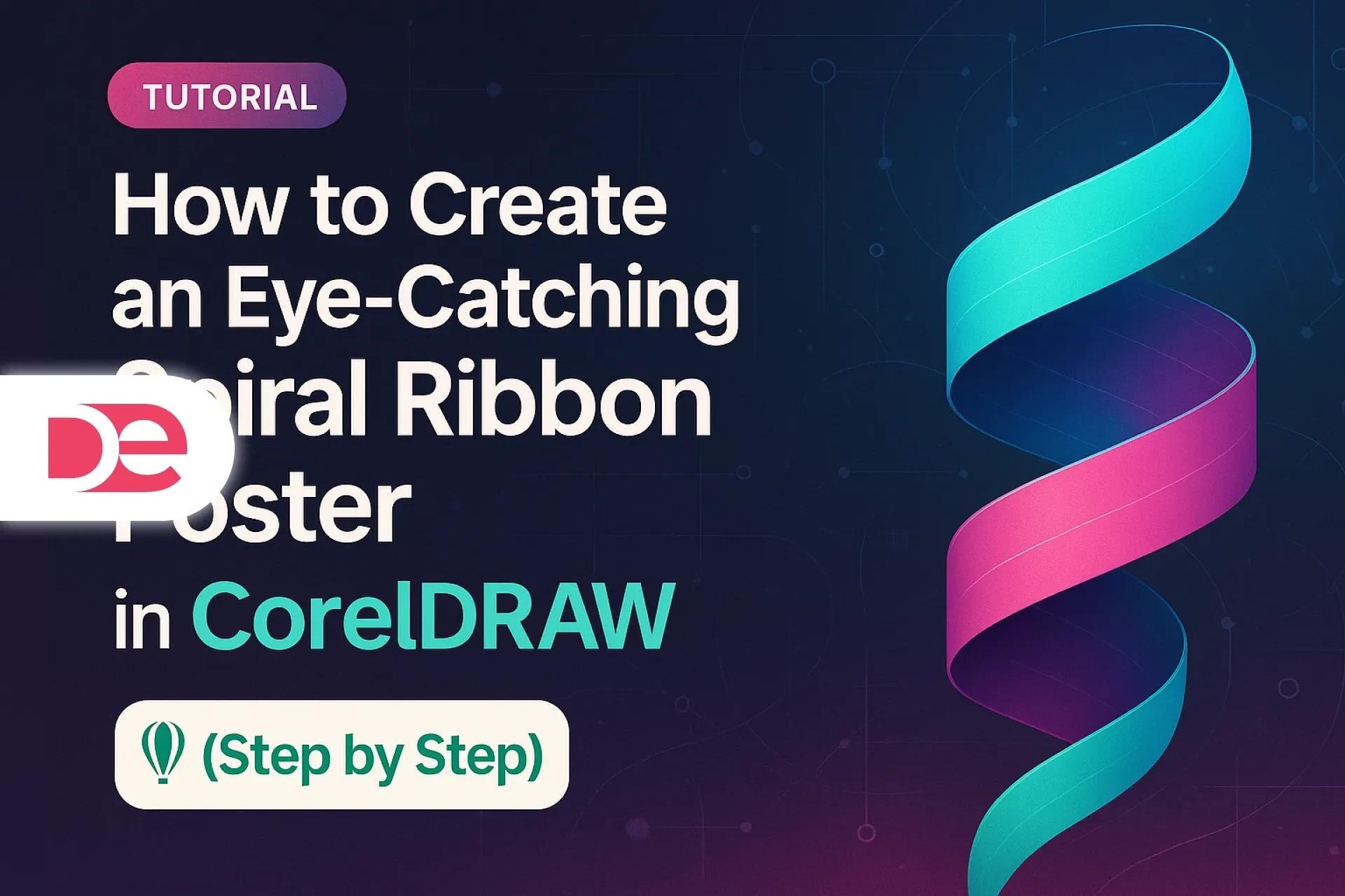
Short-form inspiration often leaves you guessing about what actually happened between the cuts. This tutorial removes the guesswork and walks you—carefully and completely—through creating a striking spiral-ribbon composition in CorelDRAW. You’ll construct a clean spiral backbone, transform simple capsules into a silky, color-rich ribbon using Blend, shape believable light with Transparency, and finish the composition cleanly with PowerClip. The result is a versatile, high-impact graphic you can reuse for posters, social banners, landing page heroes, and app splash screens.
You don’t need custom plugins or advanced scripting—just CorelDRAW’s native tools and a deliberate workflow. Every step contains practical pointers to control curvature, avoid gradient banding, and keep your vectors light, editable, and print-safe. You’ll also get a compact decision table, common mistakes to avoid, and a mini case study that adapts the method to a real editorial banner. By the end, you’ll have a repeatable method you can save as a template, swap colorways on demand, and ship across web and print without surprises.
What You’re Making (and Why It Works)
The aesthetic is “tech-forward” and clean: a spiral path carries a gradient-rich ribbon that thickens and thins as it turns, suggesting depth without heavy 3D rendering. The composition rests on three pillars:
• A mathematically tidy spiral curve as the structural backbone
• A Blend-based ribbon (interpolated shapes and colors) that follows the curve
• Transparency and clipping to sculpt light, shadow, and crisp edges for export
Because everything stays vector, you keep editability, small file sizes, and flawless scaling—ideal for brand systems, multi-format campaigns, and responsive editorial layouts.
Definitions & Context
Before diving in, here are the core tools—explained plainly:
• Spiral Tool: Draws spirals with controllable turns, expansion, and direction. You can keep it parametric or convert to curves for node-level editing.
• Blend Tool: Interpolates shape and color across a series of steps. It can run straight or be mapped along a path. Using capsules for endpoints and a long set of steps yields a ribbon with buttery transitions.
• Transparency Tool: Applies variable opacity to objects or groups. A one-direction linear transparency simulates soft shading across a ribbon’s width, creating instant depth.
• PowerClip: Non-destructively places objects inside a container shape—perfect for neat margins, multi-size exports, and social crops.
• Fountain Fill: CorelDRAW’s gradient fill. We’ll use it on the background (and optionally on shapes) to emphasize contrast.
Step-by-Step: Recreate the Spiral Ribbon Design in CorelDRAW
1) Set Up the Canvas
• Create a New Document. Choose RGB if the main use is digital; CMYK if it’s primarily for print.
• Suggested size for a poster-like look: 1920 × 2560 px (vertical).
• Turn on Snap to Objects to align components quickly.
Background
• Draw a Rectangle covering the page.
• Apply a Fountain Fill that moves from near-black in one corner to deep navy or indigo in the opposite corner. The dark backdrop will help bright ribbon colors pop and reduces the need for heavy shadowing later.
2) Draw a Precise Spiral Backbone
• Select the Spiral Tool from the toolbox.
• Choose Logarithmic so the spiral grows smoothly as it turns.
• Drag outward from your intended center. In the Property Bar, try:
• Turns: 5–7 (more turns = tighter coil and more visual rhythm)
• Expansion: 25–35% (controls how quickly the spiral grows)
• Direction: Clockwise or counterclockwise—pick what complements your layout
Optional fine-tuning
• Convert to curves (Ctrl+Q) if you want granular control.
• Use the Shape Tool to smooth handles and redistribute nodes so curves remain fluid—particularly on tight coils where uneven handles can create sudden direction shifts.
3) Build the Ribbon Endpoints
The ribbon comes from blending simple shapes. Endpoints define thickness and color.
• Draw a rounded capsule (ellipse or rounded rectangle compressed vertically) for the start. Assign a bright color (e.g., cyan).
• Duplicate it (Ctrl+D), scale the duplicate wider to create a thick midpoint marker, and assign a second vivid color (e.g., magenta).
• Optionally duplicate again and make a third, slightly narrower capsule for an end color (e.g., purple). This gives you a start → thick mid → end sequence that feels like a ribbon thickening as it swings toward the viewer and thinning as it recedes.
Create the Blend
• Activate the Blend Tool.
• Drag from the start capsule to the mid capsule; set Steps between 60 and 120 for smooth tonal transition.
• If you created a third capsule, blend from the mid to the end as a second blend, then Combine or group them as needed.
4) Map the Blend onto the Spiral
• Select your blend group, then Shift-select the spiral.
• Use Blend along full path (available in the Property Bar/contextual options).
• Enable Rotate all objects so capsule orientation follows the curve naturally.
• If the ribbon appears offset, look for Path offset or Reverse path options, or simply flip your capsules so the long axis reads correctly along the curve.
Color strategy
• Place the most saturated color at the segment you want “closest” to the viewer.
• Use analogous hues (e.g., teal → cyan → blue → magenta) for a smooth, modern spectrum that resists banding.
5) Add Depth with Transparency
• Select the Transparency Tool and apply a Linear transparency across the ribbon’s width so one edge becomes subtly darker.
• This single gradient of opacity mimics soft shading and gives the ribbon a sleek, quasi-3D presence without complex effects.
• Add a second, localized transparency at the inner coil where the ribbon appears to pass behind itself—this little detail dramatically improves depth perception.
6) Duplicate for Rhythm and Symmetry
• Group the ribbon-mapped spiral.
• Duplicate (Ctrl+D) and position the rotation pivot at the artboard center.
• Rotate the duplicate by ±30–45°. Make 3–4 copies angled around the center (e.g., 0°, 120°, 240°) if you want a pinwheel or starburst motif.
Variation for realism
• Nudge the hue or brightness of each duplicate slightly so they don’t look cloned. Tiny differences keep the composition lively without visual noise.
7) Keep Everything Tidy with PowerClip
• Draw a frame shape (usually a rectangle that matches your poster’s margin plan).
• Select all ribbon groups → Object ▸ PowerClip ▸ Place Inside Frame → click the frame.
• Use Edit PowerClip if you need to reposition or scale the contents, then Finish to return to the main scene.
8) Finish the Background
• Re-open the Fountain Fill for the background rectangle and experiment with Radial or Elliptical gradients that keep the center slightly lighter.
• Add a faint noise or grain bitmap on a top layer with 10–12% opacity to give the surface a tactile, editorial feel.
• If you plan to overlay type, consider a soft vignette at the edges so text has more legibility without needing heavy drop shadows.
9) Preflight and Export
• Check for banding: Increase blend steps, adjust color spacing, or add minute hue changes if gradients appear to band.
• Digital export: PNG or WebP at 2× target display resolution (e.g., 3840 × 5120 for high-density screens); keep RGB.
• Print export: PDF/X-4 with live transparency when possible; if a vendor requests flattening, coordinate a settings test to maintain smooth blends.
• Color management: Use soft proofing to anticipate CMYK gamut shifts; prepare CMYK approximations of neon-like hues that may dull in print.
Pros, Cons & Risk Management
Pros
• Pure vector: Minimal file size, infinite scaling, easy recoloring.
• Fast iteration: Swapping endpoints or rotating duplicates yields fresh compositions quickly.
• Non-destructive: PowerClip and Transparency avoid destructive cropping or raster tricks.
• Brand flexibility: Colorways can align with brand palettes without re-authoring geometry.
Cons
• Potential banding: Long, gentle gradients may show steps when exported at low resolution or with too few blend steps.
• Performance: Very high blend steps across multiple ribbons can slow interaction on older hardware.
• Print surprises: Vivid RGB hues may compress in CMYK.
Risk management
• Raise blend steps and introduce subtle hue jitter to fight banding.
• Modularize: keep one master ribbon and generate variants; hide or lock unused layers for performance.
• Test CMYK swatches early for print projects and export a short proof PDF.
Practical Example: Turning the Technique into a Banner Hero
Scenario: You’re building a hero image for an article on AI productivity tools.
• Canvas: 1920 × 1080 px (landscape).
• Build: Create a single spiral ribbon, duplicate twice, rotate to form a gentle star with negative space on the left for headlines.
• Color: Cool spectrum (teal/cyan with subtle magenta accents) to suggest innovation and clarity.
• Typography: Use a clean geometric sans in white or very light gray.
• Balance: Keep the highest contrast near the headline area; tone down saturation behind text.
Common Mistakes & Expert Fixes
Mistake 1: Flat ribbon with no sense of light
• Fix: Add a Linear transparency across the ribbon to darken one edge. Consider a second localized transparency where the ribbon tucks behind itself.
Mistake 2: Harsh kinks on tight coils
• Fix: After converting to curves, redistribute nodes; keep handles tangential and proportional. Moderate the spiral’s Expansion to avoid rapid radius jumps.
Mistake 3: Banding in gradients
• Fix: Increase Blend steps (80–120+), vary color stops slightly, and export at higher resolution. For print, prefer PDF/X-4 and let the RIP handle gradients with more finesse.
Mistake 4: Visually noisy symmetry
• Fix: Limit to 3–4 rotated copies. Offset hues minimally so forms feel related, not repetitive.
Mistake 5: Destructive cropping
• Fix: Use PowerClip to contain the artwork; it’s tidy, reversible, and ideal for testing multiple aspect ratios.
Mistake 6: Dull print output
• Fix: Soft-proof early, choose CMYK-friendly palettes for critical areas, and coordinate with the printer’s preferred PDF standard.
One-Page Reference: When to Use Blend vs. Fountain Fill
| Goal | Use Blend | Use Fountain Fill |
|---|---|---|
| Transition between two shapes and colors along a path | • Yes—interpolate geometry + color; ideal for ribbons following spirals | - |
| Smooth gradient within a single shape | - | • Yes—continuous color shift across one object |
| Control the number of steps to mitigate banding | • Yes—raise steps (60–120+) as needed | • Limited—add multiple color stops as a workaround |
| Map color progression along complex curves | • Yes—“blend along path” adheres to the spiral | • Indirect—you’d reshape or subdivide filled shapes instead |
Advanced Tips: Precision, Performance, and Reuse
Precision
• Pick a visible center (guides or a construction circle) before drawing the spiral so rotations land perfectly.
• If you need strict symmetry, build one quadrant, then mirror and rotate copies to eliminate cumulative drift.
Performance
• Keep a low-step working version of the blend while designing; raise steps before export.
• Place heavy layers (like noise textures) in a top folder you can toggle off during layout.
Reuse
• Save a library of endpoints (capsules with approved colors and thicknesses).
• Store PowerClip frames in common social sizes (1:1, 4:5, 16:9) and drop the artwork in for rapid crops.
• Create named color styles (Brand Primary 1, Accent 2, etc.) so global palette changes ripple through the artwork.
Mini Case Study: Editorial Poster for a Product Launch
Brief: Produce a vertical poster to introduce a new SaaS automation feature.
Approach:
• Spiral with 6 turns and 30% expansion to yield a balanced central coil.
• Ribbon endpoints in teal → cyan → electric blue, blended with 100 steps for a creamy transition.
• Two additional ribbon copies rotated ±35°; each hue-shifted by ±6° to avoid clones.
• Background with elliptical fountain fill: darkest corners, slightly lighter center.
• Headline and subhead anchored on the top third; call-to-action button styled as a rounded rectangle echoing the capsule geometry.
Result: A premium, future-leaning poster that reads clearly from a distance and carries a consistent brand voice across digital placements.
Troubleshooting Guide
The ribbon looks twisted incorrectly on certain turns.
• Reverse the path direction or re-order the endpoints so the long axis aligns with the direction of travel. Check “Rotate all objects.”
Transparency is too harsh and crushes color.
• Lower the opacity contrast and shorten the transparency ramp so the dark edge stays subtle.
Edges look jagged when exported.
• Export at 2× or 3× your target resolution, or increase anti-aliasing quality in export options. For print, rely on vector PDF.
Social crops keep cutting off the best parts.
• Work inside PowerClip frames sized to your platform’s aspect ratio, then reposition the artwork non-destructively for each export.
FAQ
Action-Oriented Conclusion
You now have a complete, repeatable method for crafting a high-impact spiral ribbon graphic in CorelDRAW. Start with a clean spiral, map a thoughtfully colored Blend, add directional Transparency for depth, and wrap the layout with a PowerClip for perfect edges and pain-free cropping. Duplicate and rotate to build rhythm; store colorways and frames so you can scale this look across posters, hero banners, and social cards in minutes.
Next steps:
• Create three brand-aligned colorways and export web + print versions.
• Save a template containing background, spiral, ribbon, and PowerClip frames for rapid reuse.
• Build a mini-library of endpoints and typographic pairings so you can ship new variants on demand.