


Affiliate disclosure: This article contains affiliate links. If you click and purchase, we may earn a commission at no extra cost to you.
Table of Contents
◉Reader Roadmap ◉What this effect actually is (in plain English) ◉Prerequisites: set yourself up for a crisp result ◉Step-by-step: Build the long-line photo letter effect ◉Mini case study: a realistic use for creators and brands ◉Opacity mask vs clipping mask vs Draw Inside (quick decision guide) ◉Common mistakes + troubleshooting ◉When you shouldn’t use this effect ◉FAQ ◉Conclusion: what you built (and what to do next) ◉Sources
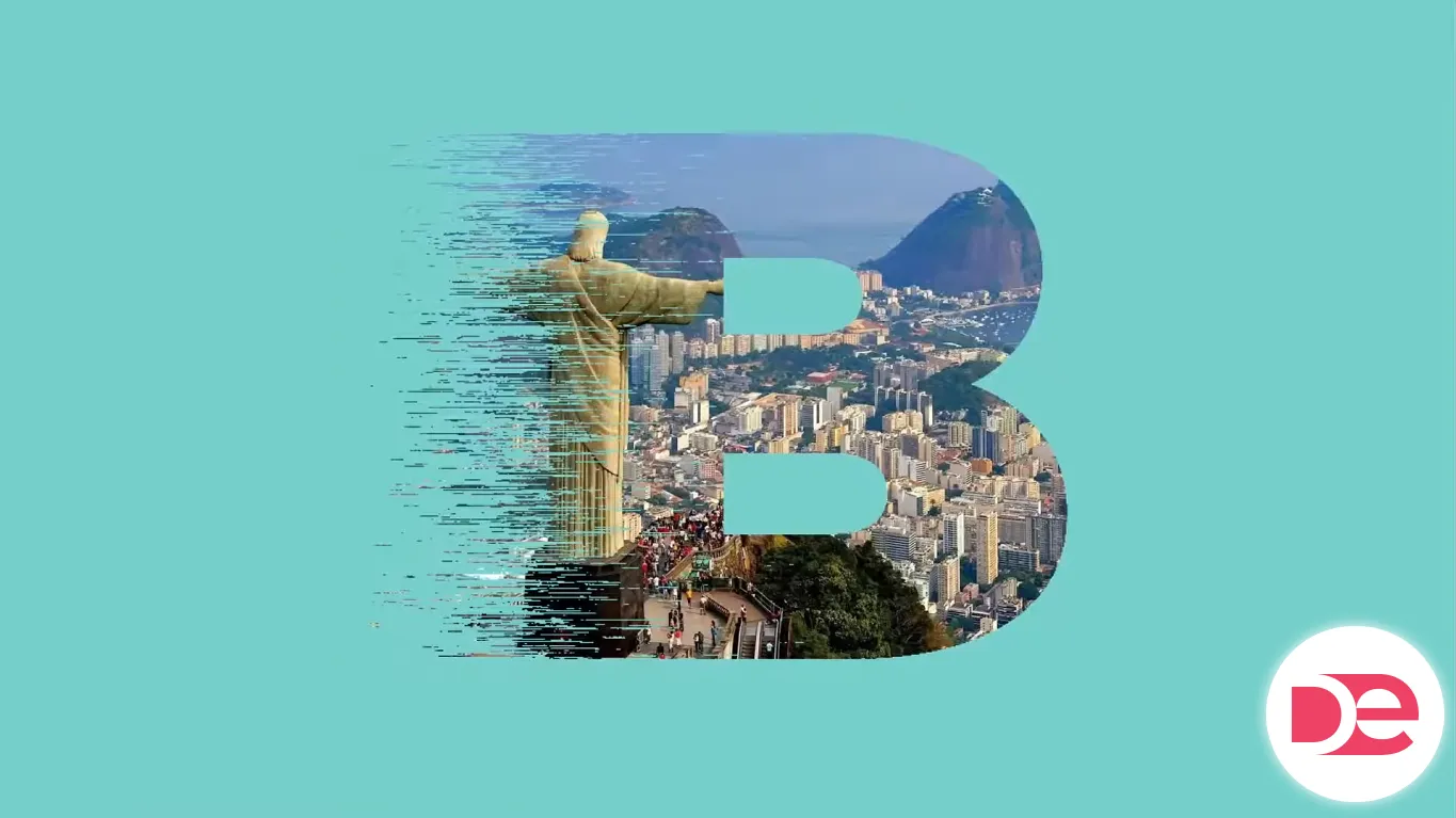
A bold initial with a gritty, long-line texture and a photo subtly revealed inside it is one of those effects that looks “high-end poster” but is totally achievable with stock Illustrator tools. It’s especially useful for cover graphics, YouTube thumbnails, event flyers, album-style visuals, and hero images—anywhere you want typography to feel tactile without turning into an unreadable mess.
In this tutorial, you’ll build the effect from scratch: start with a heavy letterform, introduce a controlled long-line “Mezzotint” texture, then blend a photo into the type using an opacity mask (not a clipping mask). Along the way, you’ll learn why raster effects settings matter, how to keep the texture art-directable, and how to avoid the most common “why does this look blurry?” and “why did my mask invert?” headaches.
You’ll need Adobe Illustrator on desktop and a basic comfort level with selecting shapes, using panels, and adjusting fills. No plug-ins required.
Don’t have Adobe Illustrator yet?
Get Adobe Illustrator so you can follow this tutorial step by step and build the long-line photo letter effect with the exact tools shown.
Get Adobe Illustrator Reader Roadmap
• What you’re making (and why masks matter) so you choose the right masking method for your goal
• Prerequisites and setup to avoid blurry textures and weird color banding
• Step-by-step build: type → outlines → split → mezzotint texture → expand → photo blend
• Common mistakes & fixes when the effect looks wrong (or exports badly)
• Alternatives & decision guide (opacity mask vs clipping mask vs Draw Inside)
• FAQ + export checklist so your final artwork looks sharp everywhere
What this effect actually is (in plain English)
You’re combining three Illustrator ideas:
1. Outlined text as editable shapes (so you can distort and style parts of a letter freely). Adobe’s standard approach is converting type to outlines. (Adobe, 2024)
2. A raster-based texture effect (Mezzotint under the Pixelate category) applied to a filled shape to create streaky “long lines.” Pixelate effects are raster-based and depend on your document’s Raster Effects Settings. (Adobe, 2024)
3. An opacity mask to reveal an image through the letter using luminance (light/dark) rather than just a hard cutout. (Adobe, 2025)
The result: one letter, multiple visual layers—clean edges, controlled “speed-line” grit, and a photo that feels integrated instead of pasted.
Prerequisites: set yourself up for a crisp result
Before you touch the Type tool, do these two things to save time later:
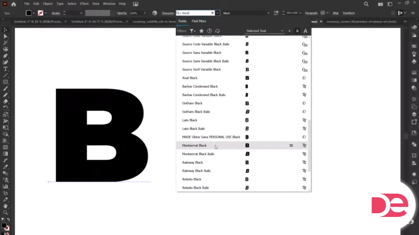
• Pick a bold font with thick strokes (e.g., geometric sans or a heavy grotesk). Thin fonts don’t give the texture room to show.
• Set Raster Effects Settings to match your final output size. Pixelate effects are raster-based, so their detail depends on your chosen resolution. (Adobe, 2024)
• Choose a high-contrast photo if you want the image to read clearly inside the letter. Low-contrast photos can work, but you’ll need extra adjustment.
If this is for print, also decide your target DPI early (typically 300 ppi for print artwork), because it changes how the Mezzotint texture appears.
Make crisp long-line textures and photo-in-type effects faster in Adobe Illustrator
Follow the exact workflow in this tutorial (Mezzotint + opacity masks) and keep results sharp with the right raster settings.
Try Adobe IllustratorStep-by-step: Build the long-line photo letter effect
1) Create your base letterform
1. Select the Type Tool (T) and click once on the artboard.
2. Type a single bold character (a big “A”, “R”, “S”, etc.).
3. Increase the size so it fills a good portion of the artboard (this makes the texture easier to art-direct).
2) Convert the text into editable shapes (outlines)
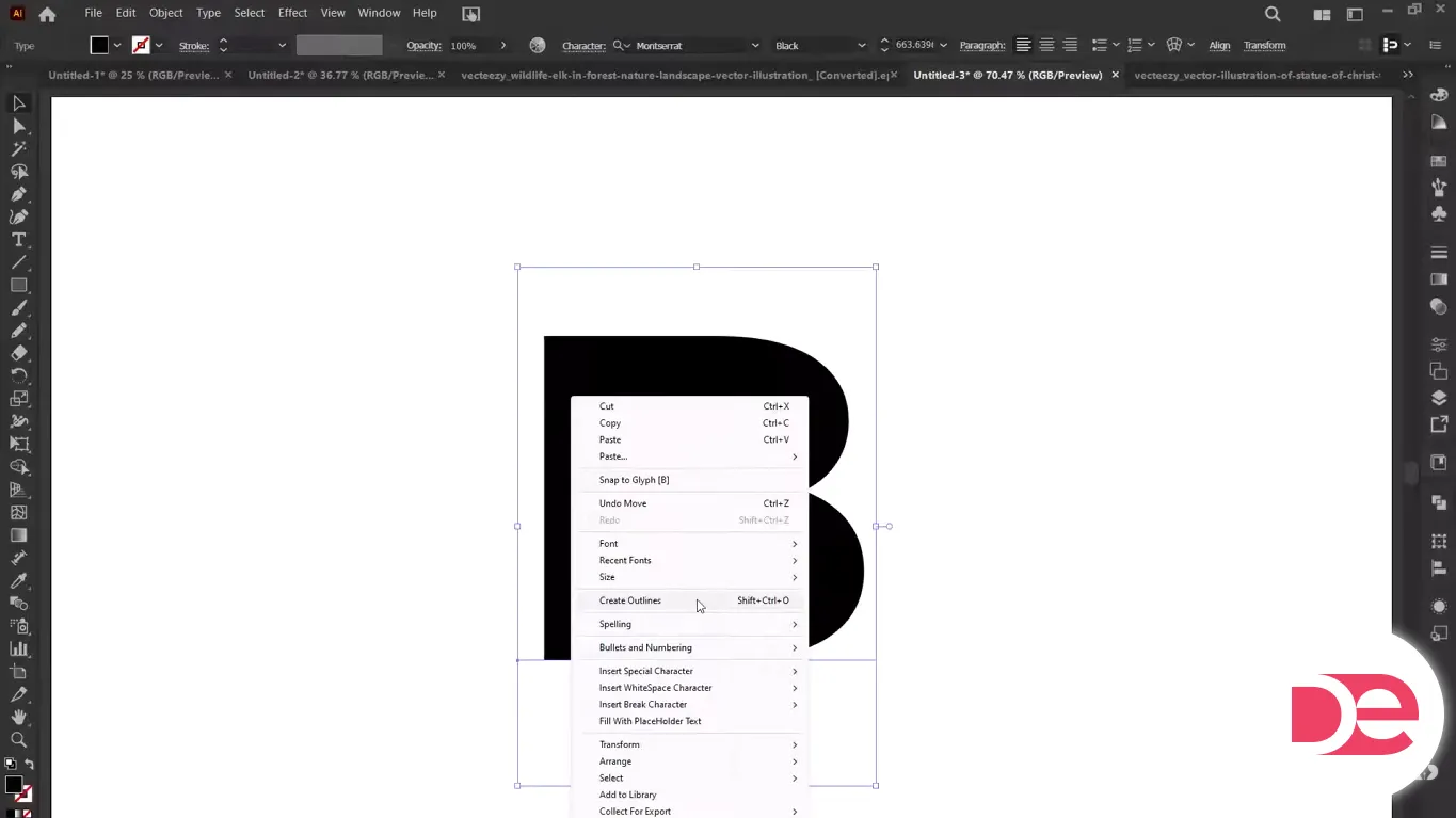
1. Select the letter with the Selection Tool (V).
2. Convert it to outlines (commonly via Type > Create Outlines / shortcut depending on OS). This turns the font into vector shapes you can edit point-by-point. (Adobe, 2024)
Why this matters: once it’s outlined, Illustrator treats it like any other vector object—so you can split it, recolor parts, and apply effects without type reflow.
3) Split the letter (so only part gets the texture)
This is the key to making the effect look designed—not “filter slapped on.”
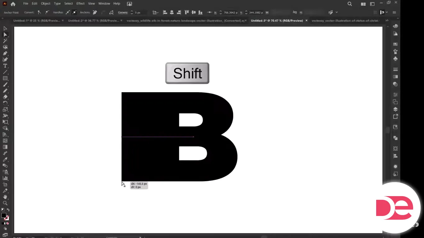
1. Switch to the Direct Selection Tool (A).
2. Drag-select the left side anchor points of the letter (or whichever side you want textured).
3. Nudge or drag that selection sideways while holding Shift to keep movement perfectly horizontal.
4. If your selection doesn’t separate cleanly:
• Use Object > Ungroup if needed
• Or use the Shape Builder Tool (Shift+M) to combine/split shapes more intentionally
You should now have a letter that visually feels “split” or offset—like it’s stretching into motion.
4) Apply a gradient to the textured section (to control where texture fades)

1. Select the section you plan to texturize.
2. Apply a gradient fill (a simple black-to-white or dark-to-light gradient works well).
3. Rotate the gradient so it fades in the direction you want the lines to intensify.
Design tip: The gradient is doing two jobs—visual depth and controlling how the Mezzotint reads. When you apply Mezzotint, the tonal transitions can influence how dense the line texture feels.
5) Add the Mezzotint “long lines” texture
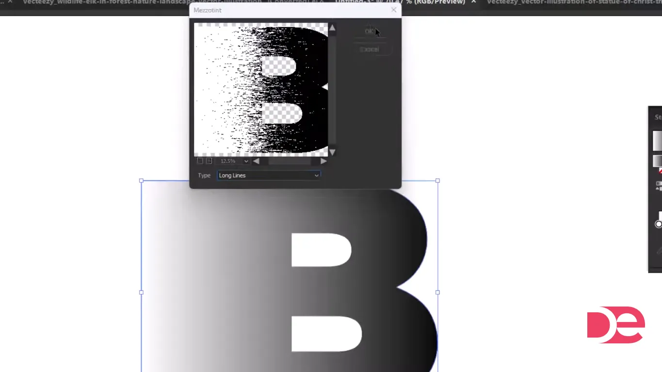
1. With the textured section selected, go to Effect > Pixelate > Mezzotint.
2. Choose a Long Lines style (naming can vary slightly by version, but you’re aiming for long streaks rather than dots).
3. Preview and adjust if needed.
Important: Pixelate effects are raster-based and use the document’s raster effects settings. If it looks chunky, noisy, or too soft, your resolution settings are likely the cause. (Adobe, 2024)
6) Reposition the texture with the Gradient Tool
This is where the effect becomes controllable instead of chaotic.
1. Select the textured section.
2. Grab the Gradient Tool (G).
3. Drag across the letter to reposition the gradient, which changes how the texture appears across the shape.
If the texture feels “too even,” you usually need a stronger gradient transition so one side has higher contrast than the other.
7) Expand the effect (so it behaves consistently)
Once you like the look:
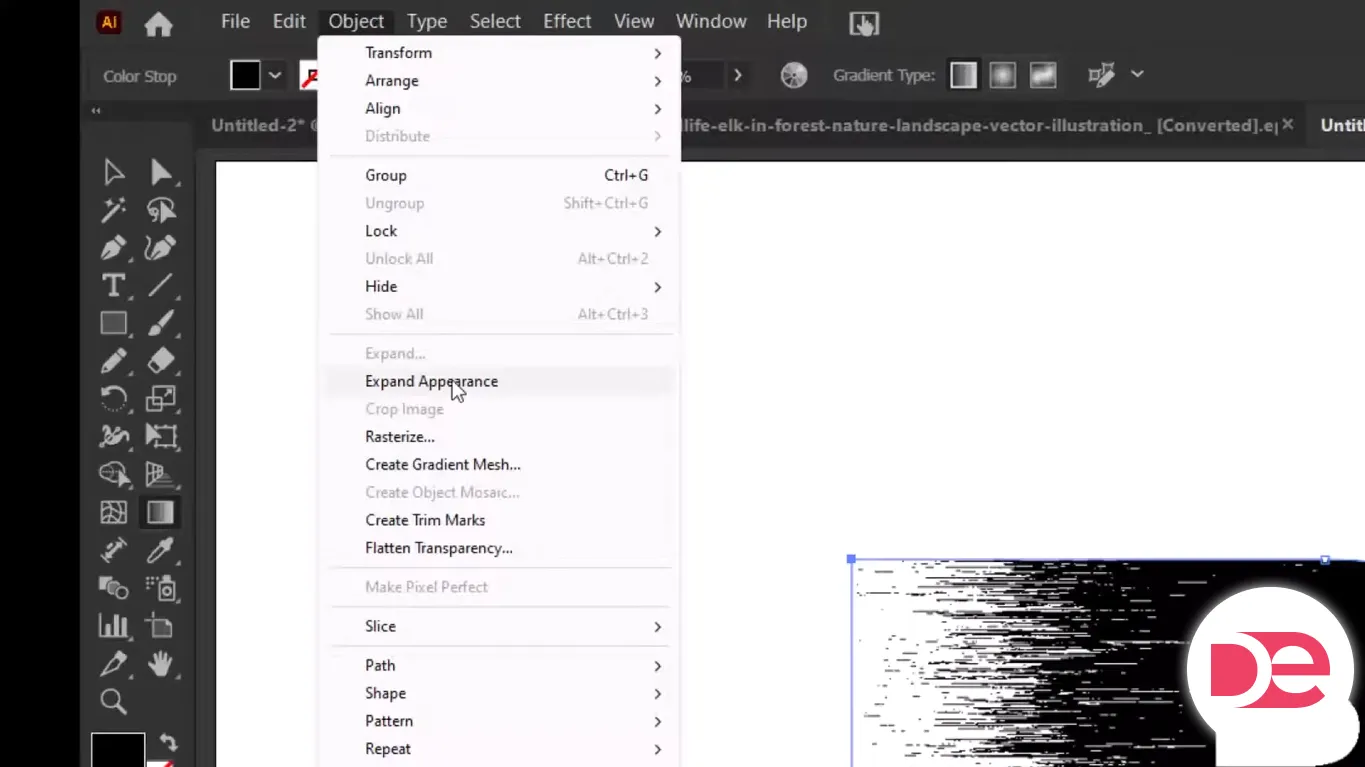
1. Select the textured object.
2. Use Object > Expand (or Expand Appearance depending on your workflow) so Illustrator converts appearance attributes into editable objects. (Adobe, 2025)
Why expand: it reduces surprises when you mask, export, or send the file to someone else. Expanding converts appearance attributes into discrete objects. (Adobe, 2025)
8) Place and embed your photo
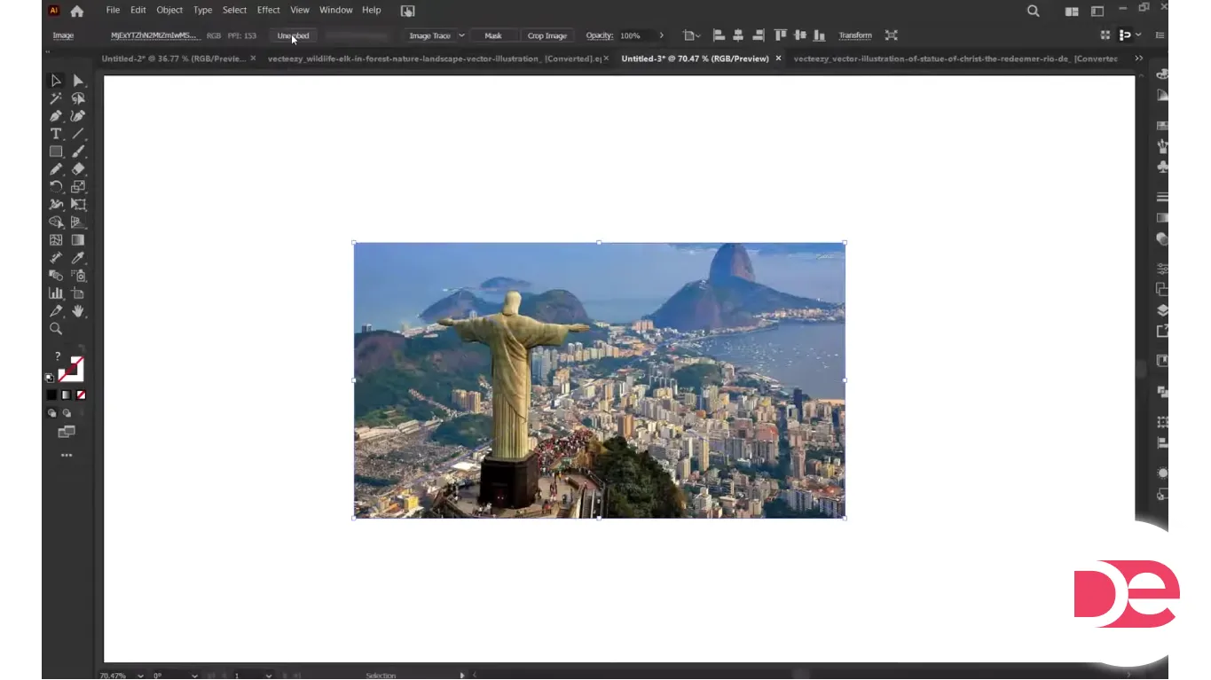
1. Go to File > Place and select your image.
2. Click to place it, then scale it to cover the letter area.
3. Embed the image if you want a fully self-contained file (highly recommended if you’re sharing the AI file).
9) Put the photo behind the letter
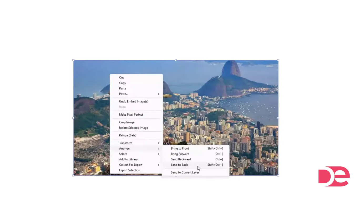
1. Select the photo.
2. Arrange it behind the letter (e.g., Object > Arrange > Send Backward / Send to Back), until it sits behind the letter shapes.
You want the image fully visible behind the letter, even if it looks messy right now—masking comes next.
10) Blend the photo into the letter using an opacity mask
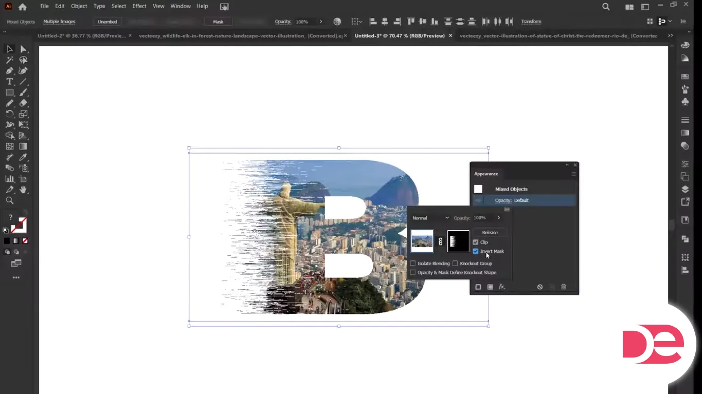
This is the “pro” step that makes the image feel integrated.
1. Select both the letter (including the textured part) and the photo.
2. Open Window > Transparency (or use the relevant panel where mask controls appear in your setup).
3. Choose Make Mask.
4. Toggle Invert Mask if the effect reveals the wrong thing (you’ll know immediately). Adobe documents mask inversion behavior as reversing luminance values. (Adobe, 2025)
5. If available, adjust Clip depending on whether you want the mask bounded tightly.
Masking tip: Opacity masks use luminance. Bright areas reveal more; dark areas conceal more. That means you can “tune” how much photo shows by adjusting the mask artwork’s brightness/contrast.
11) Finish: background, contrast, and export polish
Now that the photo and letter are blended:
• Add a solid background rectangle behind everything for a poster-style look
• Nudge contrast by adjusting the photo (if needed) before masking, or by adding a subtle overlay shape
• Save an editable AI file, then export for your destination (web, social, print)
Mini case study: a realistic use for creators and brands
Imagine you’re designing a hero graphic for a productivity article titled “Focus”. You use an oversized “F”:
• Left half: long-line mezzotint texture (implies speed/energy)
• Inside: a photo of a desk setup (context and mood)
• Background: muted dark tone for contrast
Why it works: the texture adds motion, the photo adds story, and the letter stays readable at thumbnail sizes. This combination is strong for blog headers, podcast covers, and LinkedIn visuals where you need “scroll-stopping” without looking like a template.
Opacity mask vs clipping mask vs Draw Inside (quick decision guide)
| Method | Best for | Pros | Tradeoffs |
|---|---|---|---|
| Opacity Mask | Subtle blends, textured reveals | Luminance-based control, can fade smoothly | Can confuse at first (Invert/Clip toggles) |
| Clipping Mask | Hard cutout photo-in-text | Simple, predictable edges | No soft blending unless you add extra steps |
| Draw Inside | Quick illustration workflows | Fast for placing art inside shapes | Less flexible for complex texture blending |
If you want the photo to feel printed into the texture, opacity masks are usually the right choice. (Adobe, 2025)
Common mistakes + troubleshooting
The texture looks blurry or low-quality
Diagnosis: Your raster effect resolution is too low, or you’re scaling after applying effects. Pixelate effects are raster-based and follow document raster settings. (Adobe, 2024)
Fixes:
• Increase your document Raster Effects Settings before finalizing the texture
• Apply Mezzotint at final size (or reapply after resizing)
• Export at an appropriately high resolution for your use case
The mask reveals the opposite of what you want
Diagnosis: Mask luminance is inverted—common with opacity masks.
Fixes:
• Toggle Invert Mask; Adobe notes it reverses luminance values. (Adobe, 2025)
• Check whether the mask artwork is light where you want visibility
The photo looks “washed out” inside the letter
Diagnosis: The mask is too bright overall, or the image lacks contrast.
Fixes:
• Darken the mask artwork slightly (so less shows through)
• Use a higher-contrast photo
• Add a subtle dark overlay rectangle above the photo and below the mask source
Expanding breaks the look
Diagnosis: You expanded too early or expanded the wrong layer/group.
Fixes:
• Duplicate your textured object before expanding (keep a “live effects” backup)
• Expand only once you’re happy with texture placement
• Remember: Expand converts appearance attributes into objects. (Adobe, 2025)
The letter edges look jagged after export
Diagnosis: Export settings (anti-aliasing, resolution, or scaling) are off.
Fixes:
• Export at 2× size for web, then downscale if needed
• Use PNG for crisp edges on flat backgrounds
• For print, export PDF with appropriate quality settings
When you shouldn’t use this effect
• If the text must be readable at very small sizes (e.g., UI labels)—the texture competes with legibility
• If you’re producing ultra-lightweight SVGs—Mezzotint and raster-based effects don’t translate cleanly to pure vector output
• If you need strict brand typography control—outlining text means it’s no longer editable as type (keep a live-text copy on a hidden layer)
FAQ
Conclusion: what you built (and what to do next)
You created a bold letter effect that combines a long-line Mezzotint texture, gradient-controlled intensity, and a photo reveal using an opacity mask. The “secret sauce” is controlling raster-based texture quality through document settings and using luminance logic in the mask to make the image feel integrated.
Next steps you can try:
• Swap the photo for a different mood (cityscape, portrait, product shot)
• Build a set of initials for a brand system
• Animate the look in After Effects by exporting layered assets (optional)
Quick checklist before you export
• Did you set raster effects resolution appropriately? (Adobe, 2024)
• Do you have a backup copy before expanding? (Adobe, 2025)
• Does the mask reveal correctly (Invert Mask)? (Adobe, 2025)
• Is the letter readable at the smallest size you’ll publish?
Start Creating in Adobe Illustrator