


Affiliate disclosure: This article contains affiliate links. If you click and purchase, we may earn a commission at no extra cost to you.
Table of Contents
◉ Why hover button animations matter in modern UI prototypes ◉ Setting up your button design in Adobe XD ◉ Building the masked hover animation with object masks ◉ Turning the button into a component with hover states ◉ Defining the animation: positions, size, and opacity ◉ Quick reference: Default vs Hover configuration ◉ Wiring the hover interaction in Prototype mode ◉ Pros, cons, and risks of this hover technique ◉ Practical example: a contact button for a creative agency landing page ◉ Common mistakes and expert tips ◉ Accessibility and UX best practices for hover buttons ◉ FAQ: Hover button components in Adobe XD ◉ Conclusion: Make your buttons feel alive with minimal effort
Interactive buttons are one of those tiny details that instantly make your UI prototypes feel “real.” When a button responds to a hover with movement and color changes, stakeholders instinctively understand that the interface is clickable, polished, and thoughtfully designed. In tools like Adobe XD, these hover microinteractions are also fast to build once you know the right workflow.
In this tutorial, you’ll learn how to recreate a smooth, professional hover animation for a call-to-action button using Adobe XD’s component states and auto-animate. We’ll start from a simple rounded rectangle, add text, design a hover look, and then wire everything together into a reusable component you can drop anywhere in your prototype.
You’ll see how object masks, component states, and easing curves work together to create a refined animation—without any code. Along the way, you’ll get tips on accessibility, performance, common mistakes to avoid, and ideas for adapting this pattern to your own landing pages, product UIs, or marketing sites.
By the end, you’ll have a fully interactive “Contact us → Let’s work together” hover button you can tweak for any project.
Don’t have Adobe XD yet?
Install Adobe XD so you can follow this hover button tutorial step by step, prototype interactions, and preview your UI in real time.
Get Adobe XD nowWhy hover button animations matter in modern UI prototypes
Before jumping into the steps, it’s helpful to understand what you’re building and why it matters.
A hover effect is a visual change that occurs when a user’s cursor moves over an interactive element, like a button or link. In modern UI design, hover states are a key part of microinteractions—small, purposeful animations that provide feedback and guide users.
Well-crafted hover buttons can:
• Make clickable elements more obvious, reducing confusion.
• Convey brand personality with motion and color.
• Help prioritize primary actions (like “Sign up” or “Contact us”) over secondary ones.
• Improve stakeholder buy-in by making prototypes feel closer to a real product.
In Adobe XD, hover animations are built using components and component states:
• Component: A reusable UI element (like a button, card, or navigation item) that you can place multiple times across your design.
• State: A variation of a component, such as Default, Hover, or Pressed, that can visually and behaviorally differ while remaining linked to the same base component.
By combining these with object masks and auto-animate transitions, you can create hover effects where text slides out, new text fades in, colors change, and the whole interaction feels smooth and intentional.
Setting up your button design in Adobe XD
Let’s start from a blank artboard and quickly build the visual design for your button’s default and hover states.
Step 1: Create the base button shape
1. Select the Rectangle tool in Adobe XD.
2. Draw a rectangle with the size 250 x 64 px. This is a great starting size for a primary button on desktop interfaces.
3. Center the rectangle on your artboard using the alignment controls so you can easily see your work.
Now, round the corners:
• Grab the corner radius handle (the little circle near any corner).
• Drag it inward until the rectangle becomes a fully rounded pill-shaped button.
Apply the base color:
• Set the fill to a strong blue, using the hex code #2992F9 (based on the original tutorial).
• Remove the border (stroke) to keep the design clean and modern.
At this point, you have a pill-shaped button with a solid blue background—your default visual state.

Design, prototype, and preview hover buttons faster with Adobe XD
Use Adobe XD’s components, states, and Auto-Animate to build smooth hover button interactions, reusable UI patterns, and realistic product flows without writing code.
Get Adobe XD to follow this tutorialStep 2: Add and style the button label
Next, add the primary call-to-action text.
1. Select the Text tool.
2. Click inside the button and type: Contact us.
3. Choose a clean, modern typeface. The original tutorial uses Proxima Nova, but you can also use system fonts like Inter, Roboto, or Helvetica if Proxima Nova isn’t available.
Recommended text settings:
• Font: Proxima Nova (or a similar geometric sans-serif)
• Weight: Regular or Medium
• Size: 20 pt
• Alignment: Centered
• Color: White (#FFFFFF)
Now align the text:
• Select both the button rectangle and the text.
• Use the alignment tools to center them horizontally and vertically.
• Group them together using Command + G (Mac) or Ctrl + G (Windows).
This grouped element is your Default button design.
Step 3: Duplicate the button to create the hover design
To build a hover animation, you first need to define what the button looks like in its hovered state.
1. With the grouped default button selected, duplicate it using Command + C then Command + V (or Ctrl equivalents on Windows).
2. Move the duplicate slightly to the side for now so you can work on it separately.
Design the hover appearance:
• Select the duplicated button’s background shape.
• Change its fill color to a lighter, softer blue, such as #E1E7F5.
• Select the text and change its color to black (#000000) or a near-black for better readability on the light background.
• Update the text from “Contact us” to “Let’s work together” to signal a more inviting, conversational hover message.
You now have:
• A default state: blue background, white “Contact us” text.
• A hover state: light blue background, black “Let’s work together” text.
The magic of the hover animation will come from smoothly sliding and fading between these two designs.
Building the masked hover animation with object masks
The original YouTube tutorial uses a clever trick: both button states exist within one area, and a mask reveals only the portion you want to show at any time. Then, auto-animate interpolates the positions and opacities to produce a smooth hover effect.

Step 4: Stack the default and hover button groups
1. Drag the hover button group (the light one) on top of the default button group.
2. Use Command + Shift + [ (Mac) or Ctrl + Shift + [ (Windows) to send the selected group to the back if needed. You want both buttons aligned and overlapping in the same area.
At this stage, you essentially have two full buttons on top of each other. The mask will allow only one “window” into them.
Step 5: Create a mask shape
1. Double-click into the grouped buttons until you can select the background rectangle of one of them.
2. Copy that rectangle (Command + C / Ctrl + C).
3. Click somewhere on the artboard or pasteboard so nothing is selected.
4. Paste the rectangle (Command + V / Ctrl + V). This creates a standalone shape you will use as a mask.
Position this new rectangle directly over the overlapping buttons so it covers them perfectly.
Step 6: Apply the object mask
1. Select the following at the same time:
• The default button group
• The hover button group
• The newly pasted rectangle on top (the mask shape)
2. Apply an object mask using Command + Shift + M (Mac) or Ctrl + Shift + M (Windows).
Adobe XD will group these into a masked group, where the mask shape defines what part of the content is visible.
From the outside, this looks like a single button. Inside the mask, both button designs are stacked and ready to animate.
Turning the button into a component with hover states
Now that your visual structure is ready, it’s time to convert the masked button into a component and define its states.

Step 7: Create a component
1. Select the masked button group.
2. In the Property Inspector, click the “+” icon in the Component section.
3. Adobe XD will create a new component with a Default State.
Components let you drop this button anywhere in your design and keep its behavior consistent across the prototype.
Step 8: Add a Hover state
With the component selected:
1. In the Component section, click the “+” icon next to the states.
2. Choose Hover State.
You now have two states tied to the same component:
• Default State — what the button looks like normally.
• Hover State — what the button looks like when your cursor hovers over it.
We’ll now configure each state’s internal layout so auto-animate knows how to transition between them.
Defining the animation: positions, size, and opacity
The animation works by changing the positions and visibility of the two button labels inside the mask.
Step 9: Configure the Default state layout
First, select the Default State in the Component panel.
Then, double-click into the mask group until you can select the internal elements.
Inside the mask, you should see:
• The “Contact us” grouping (blue background + text).
• The “Let’s work together” grouping (light background + text).
Adjust the layout for the default view:
1. Move the “Contact us” grouping so it sits perfectly centered within the mask area.
2. For the “Let’s work together” text:
• Reduce the font size slightly (for example, from 20 pt to something smaller).
• Re-center it within its own button rectangle.
• Set its opacity to 0% so it’s invisible in the Default state.
3. Optionally, position the hover grouping slightly off to one side if you want more dramatic motion when it slides in later.
The idea: in the Default state, the user sees only “Contact us,” while the hover text is hidden.
Step 10: Configure the Hover state layout
Switch to the Hover State in the Component panel.
Now define what should be visible when the user hovers:
1. Select the “Contact us” grouping and move it out of the visible mask area, for example, sliding it to the left or right. This is what creates the “sliding away” effect on hover.
2. Select the “Let’s work together” text:
• Set the font size back to 20 pt so it matches the default label size.
• Set opacity to 100% so it’s fully visible.
• Re-center it within the mask so it sits perfectly inside the button shape.
Now XD knows that between Default and Hover:
• One text group moves out of the mask.
• The other text group moves into place and fades in.
• The colors shift between the background rectangles.
If you use Auto-Animate, Adobe XD will interpolate these differences into a smooth animation.
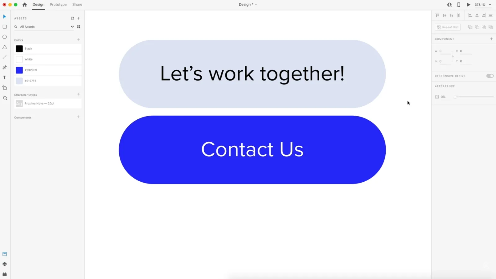
Quick reference: Default vs Hover configuration
Here’s a summary of properties for each state:
| Element | Default State | Hover State |
|---|---|---|
| Background color (visible) | Blue #2992F9 | Light blue #E1E7F5 |
| Visible text | “Contact us” | “Let’s work together” |
| Hidden text | “Let’s work together” at 0% opacity | “Contact us” moved outside mask |
| Text size for hover message | Smaller (e.g., 16–18 pt) at 0% opacity | 20 pt at 100% opacity |
| Text position for visible label | Centered in button | Centered in button |
| Animation behavior | Starting positions and visibility | End positions and visibility for hover auto-animate |
This is your single table for the article, so you’re within the requirement.
Wiring the hover interaction in Prototype mode
With the visual states defined, the last step is to configure the actual hover interaction.
Step 11: Set the hover trigger and easing
1. Switch to the Prototype tab in Adobe XD.
2. Select the component (not just an internal element).
3. In the Interaction panel, ensure the trigger is set to Hover.
4. Set the action type to Auto-Animate so XD animates between the Default and Hover state.
5. Choose an easing curve, such as Ease In-Out, for a smooth motion.
6. Set the duration to around 0.6 seconds (0.6s). This is long enough to feel intentional but still snappy.
Now, when you enter Preview mode and move your cursor over the button, the following will happen:
• The “Contact us” text slides out of the mask and disappears.
• The “Let’s work together” text grows to 20 pt, fades in, and re-centers.
• The background switches to the lighter hover color.
All of this happens automatically from the differences you defined between states.
Pros, cons, and risks of this hover technique
This approach is powerful and flexible, but no technique is perfect. Here’s how it stacks up in real-world use.
Advantages
• Reusable: Once built as a component, you can reuse this button across multiple artboards and projects.
• No code required: Designers can explore motion and microinteractions purely in the design tool.
• Flexible copy: You can use different messages for each state (“Contact us” vs. “Let’s work together”) to add personality.
• On-brand motion: Adjust color, timing, and animation direction to match your brand’s tone.
Limitations and risks
• Desktop-focused pattern: Hover effects don’t exist on touch-only devices. You’ll need alternative patterns for mobile.
• Accessibility concerns: Relying solely on hover to convey critical information can exclude keyboard-only or assistive tech users.
• Overuse of animation: Too many animated elements can feel distracting or slow. Use hover effects sparingly for key actions.
• Performance in large prototypes: Many complex auto-animate components can sometimes slow down preview performance, especially on older hardware.
Mitigate these issues by making sure the button still works and makes sense in its default state without the hover animation.
Practical example: a contact button for a creative agency landing page
To see how this plays out in a real scenario, imagine you’re designing a landing page for a creative agency.
You might have a hero section with a headline like:
“We turn complex ideas into clear digital experiences.”
Underneath, your primary call-to-action is a button using this hover effect.
In the default state, the button reads:
“Contact us”
On hover, the button transitions to:
“Let’s work together”
This subtle shift from a generic label to a more collaborative phrase reinforces your brand tone—friendly, partner-oriented, and proactive—without adding extra UI elements or clutter.
You can place this button in multiple sections:
• Hero area as the primary action.
• In a “Services” section where potential clients may want more detail.
• Near the footer as the final call to action.
Because it’s a component, updating the design or animation in one place can ripple across the entire prototype.
Common mistakes and expert tips
Even simple hover buttons can go wrong if you rush the details. Here are pitfalls to avoid and expert tips to keep your interactions polished.
Frequent mistakes
• Forgetting to update both states
Designers sometimes change colors or text in the Default state and forget to mirror those updates in the Hover state, leading to jarring transitions.
• Inconsistent alignment
If the text isn’t perfectly centered in both states, the animation may look like it “wobbles” instead of sliding smoothly.
• Too many changes at once
Changing color, size, position, and opacity all at once can make the animation feel chaotic. It’s better to focus on one or two primary changes.
• Animations that are too fast or too slow
Animations under 0.2s can feel twitchy; those longer than 0.8s may feel sluggish. Around 0.4–0.6s is a good sweet spot for hover transitions.
Expert tips for smoother hover buttons
• Start with subtlety
Use small position shifts and modest opacity changes first. You can always dial up the motion later.
• Use consistent easing curves
Stick with Ease In-Out or similar curves across your UI so interactions feel cohesive.
• Name your layers and groups clearly
Use names like “Default_Button,” “Hover_Button,” “ContactUs_Text,” and “LetsWork_Text” so you can quickly find elements inside complex masks.
• Test against different backgrounds
Preview your button on light, dark, and image backgrounds to ensure colors remain legible.
• Create variants for mobile
On mobile artboards, consider using a tap-based state change or a clearly visible pressed state instead of hover.
Accessibility and UX best practices for hover buttons
A beautiful animation is only half the story. You also need to ensure your button is usable and accessible.
Color contrast
For users with low vision or color vision deficiencies:
• Ensure your text meets at least WCAG AA contrast guidelines against both the default and hover background colors.
• Darken the hover background or adjust text color if necessary to maintain readability.
Keyboard and screen reader users
Remember that hover is a mouse-only concept. Keyboard users tab through focusable elements, and screen readers interpret UI via semantic information, not visual states.
To keep your design accessible:
• Make sure the default state alone communicates enough information. The button label should still make sense without seeing the hover text.
• In actual implementation, ensure your developers provide a clear focus style (like an outline) when the button is tabbed to.
• Avoid putting critical information exclusively in the hover label. Use hover animations to enhance, not define, the experience.
Motion sensitivity
Some users are sensitive to motion or prefer reduced motion settings at OS level.
While Adobe XD prototypes don’t read system preferences, you can:
• Keep motion smooth and minimal, avoiding excessive bounces or rotations.
• Avoid chaining multiple animations on hover (e.g., sliding, scaling, and rotating all at once).
By respecting accessibility principles, your hover buttons can feel delightful without excluding users.
FAQ: Hover button components in Adobe XD
A beautiful animation is only half the story. You also need to ensure your button is usable and accessible.
Conclusion: Make your buttons feel alive with minimal effort
In just a few steps, you’ve built a professional, animated hover button in Adobe XD that:
• Uses object masks to control visibility.
• Leverages component states to define Default and Hover behavior.
• Relies on auto-animate and easing to create smooth transitions.
• Is reusable across multiple artboards and projects.
This workflow turns simple rectangles and text into interactive, brand-aligned microinteractions that elevate your prototypes from static mockups to convincing product simulations. Once you’re comfortable with this pattern, experiment with variations: different labels, icons that slide in, color overlays, or subtle scaling effects.
Your next step? Duplicate the component, tweak the palette and copy for another project, and start building a small library of interactive buttons you can reuse in every prototype.
Get Adobe XD and bring your hover buttons to life