


Affiliate disclosure: This article contains affiliate links. If you click and purchase, we may earn a commission at no extra cost to you.
Table of Contents
◉ What Makes a Modern Sports Poster Stand Out? ◉ Plan Your Concept and Gather Assets ◉ Step-by-Step: Building the Fiery Sports Poster in Photoshop ◉ Pros, Cons, and Risks of the Fiery Sports Poster Style ◉ Mini Case Study: A Game-Day Poster for a Local Team ◉ Common Mistakes and Expert Fixes ◉ FAQ: Sports Poster Design in Photoshop ◉ Conclusion: Turn Up the Heat in Your Next Design
When you scroll through social feeds for major sports leagues, you rarely see plain photos anymore. Instead, you see cinematic posters: dramatic lighting, streaks of motion, glowing embers, and bold color grading that makes every athlete look larger than life. The good news is that you don’t need a full agency team to create that kind of impact. With Adobe Photoshop and a handful of well-structured techniques, you can build a high-energy sports poster that looks ready for prime time.
In this tutorial, you’ll learn how to design a fiery, game-day style sports poster from scratch. You’ll combine a cut-out athlete with a dramatic sky, stadium-like elements, fire overlays, advanced lighting, and a custom color grade using lookup tables (LUTs) and Camera Raw. The entire workflow is non-destructive, meaning you can tweak details as you go without starting over.
Whether you’re designing for a local team, a fitness brand, or your own personal portfolio, this approach gives you a repeatable blueprint. Once you’ve gone through it end to end, you’ll be able to adapt the same recipe to any sport, color palette, or mood you want to create.

In the sections below, you’ll get context on the style, a detailed step-by-step guide, a mini case study, and expert tips to avoid common mistakes—so you can confidently turn up the heat in your next design.
Don’t have Photoshop yet?
Get access to Photoshop so you can follow this fiery sports-poster tutorial step by step and experiment with every technique as you go.
Get Photoshop to follow alongWhat Makes a Modern Sports Poster Stand Out?
Before you dive into layers and blend modes, it helps to understand the design elements that make this style work so well.
At its core, a modern sports poster of this type is a photo composite: a single image built from multiple assets (subject, background, effects, textures, and color grading). The magic isn’t just in the individual pieces but in how they’re blended together.
Key ingredients in the fiery sports-poster look include:
• A clean, high-resolution cut-out of the athlete, treated as the hero of the frame.
• A stylized environment—often a dramatic sky or stadium backdrop.
• Foreground elements, like fences or track edges, to add depth.
• Energy effects, such as fire, sparks, or light streaks.
• Strong, cohesive color grading that ties every layer together.
You’ll also rely on a few concepts:
• Blend modes: Especially Screen, Soft Light, and similar modes that let bright areas blend into the composition while hiding darker areas.
• LUTs (Look-Up Tables): Color presets that map one set of colors to another, giving your design a consistent cinematic tone.
• Non-destructive editing: Using Smart Objects, adjustment layers, and masks so you can tweak or reverse decisions at any point.
• Camera Raw Filter: A powerful, all-in-one correction and grading panel for clarity, texture, saturation, and HSL (Hue/Saturation/Luminance) adjustments.
Once you understand these building blocks, the step-by-step process becomes much easier to follow and adapt.
Plan Your Concept and Gather Assets
Even the best Photoshop skills can’t fix a weak source image. Spend a few minutes planning your concept and gathering solid assets before you open the app.
Think through:
• Sport and mood: Is this about intensity, speed, or focus? A fiery color palette with reds and warm oranges suggests aggression and power.
• Primary subject: Use a high-resolution image of the athlete with good lighting and clear separation from the background. A pre-cut PNG or a well-made subject selection will save you a lot of time.
• Environment: For a dramatic look, a moody sky or stadium lights work well. You can also combine a sky with subtle ground elements like a track or field.
• Foreground and midground elements: Fences, track edges, or stadium barriers add depth and context.
• Fire and light overlays: Use PNGs or stock images of flames and sparks that look realistic and have dark backgrounds, which blend easily with Screen mode.
Organize your files into folders (subject, sky, fire, overlays, LUTs) so you can drag them in quickly. This small step keeps your workflow smooth once you’re inside Photoshop.

Supercharge your fiery sports posters with Photoshop
Unlock Photoshop’s advanced compositing, lighting, and color-grading tools so you can build high-impact, game-day ready posters faster and reuse this step-by-step workflow for any sport or campaign.
Start designing in PhotoshopStep-by-Step: Building the Fiery Sports Poster in Photoshop
1. Create the Canvas
Start by setting up your document at a versatile size and aspect ratio.
• Go to File → New.
• Choose a 4×5 aspect ratio (for example, 2000 × 2500 pixels). This format adapts well to social feeds and prints.
• Set Resolution to at least 200 ppi (you can go to 300 ppi for print-heavy work).
• Use RGB Color mode so you can take advantage of vibrant screen colors and LUTs.
Click Create and you’ll have a blank canvas ready to go.
To avoid working on pure white, add a solid fill layer with a dark, neutral color. This temporary background will later be replaced by your sky, but it gives you contrast as you start building.
2. Place and Prepare the Main Athlete
Your hero subject should be placed early so every design decision supports them.
• Drag the athlete image into Photoshop and drop it onto the canvas.
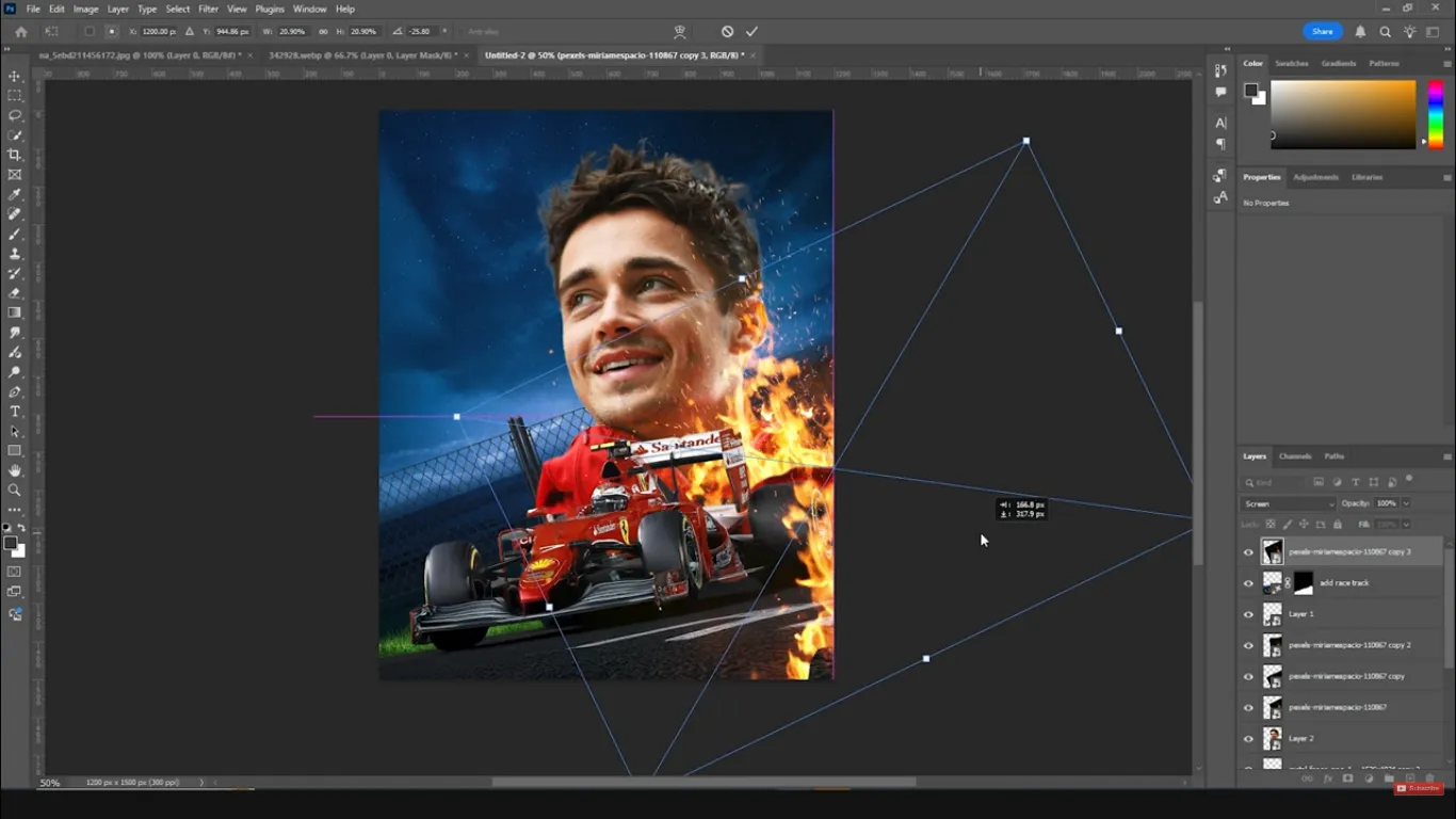
• Right-click the layer and choose Convert to Smart Object. This keeps scaling and filters non-destructive.
• Press Ctrl + T (Free Transform) and, while holding Alt + Shift, scale the subject proportionally until it fills the central area of the frame.
Position the player slightly off-center—usually a bit above the vertical centerline. This gives you room for text or extra effects above and below.
If your subject isn’t already cut out, use one of these options:
• Select Subject (for quick AI-based selection), then add a Layer Mask.
• Pen Tool for precise, manual cut-outs.
Clean edges at this stage will make the final composite much more believable.
3. Build the Background Environment
With your subject placed, it’s time to create a world that matches their energy.
1. Sky layer
• Drag a dramatic sky image (clouds at sunset, stormy sky, stadium lights) below the athlete layer.
• Scale and rotate it so the most interesting cloud detail sits behind the player’s upper body and head.
• The horizon line should feel roughly behind the athlete’s waist or hips, not cutting through the head.
2. Ground and depth elements
For a sports poster, a track, field, or abstract ground can add context. If you have a track or stadium image, place it under the athlete and adjust perspective with Edit → Transform → Distort or Perspective.
3. Fence or barrier elements
Fences in the foreground create depth and a sense of being up close to the action.
• Drag a fence PNG into the document and place it in front of the player.
• Use Ctrl + T to rotate slightly, and scale it to span part of the lower frame.
• Duplicate the fence layer (Ctrl + J) and move copies left or right to cover the whole width.
By layering fences at slightly different sizes and rotations, you fake perspective and make the environment feel more immersive.
4. Extend the Track or Ground with Generative Fill
If your ground or track image doesn’t fully cover the area you want, Photoshop’s AI generative tools can help.
• Use a selection tool (like the rectangular marquee or lasso) to select the empty area where you want the track or ground to extend.
• Choose Generative Fill and type a simple prompt such as “track” or “stadium ground”.
• Let Photoshop generate a few variations and pick the one that fits your lighting and perspective best.
You can always refine the mask on the generative layer to blend it more naturally into the existing track or ground. Feather the mask edges slightly so there aren’t any harsh transitions.
5. Add Fire Overlays for Dynamic Energy
Now comes the element that sells the “heat” theme: fire.
Use flame or ember overlays that are photographed on dark backgrounds. That makes them ideal for blend modes like Screen.
• Drag a fire overlay into your document and place it above the background but below the main subject, depending on where you want the flames to appear.
• Change the Blend Mode to Screen. This removes the dark background and keeps only the bright flames.
• Press Ctrl + T to scale and rotate the flames so they follow the perspective of the ground or track.
Duplicate the flames (Ctrl + J) and scatter them across the scene:
• Some near the athlete’s feet or track edges.
• Some in the midground, behind the player’s legs or sides.
• A few small flames or sparks slightly overlapping the subject to unify foreground and subject.
Use Layer Masks on the fire layers to erase any unwanted areas, so the flames don’t cover critical details like the athlete’s face.
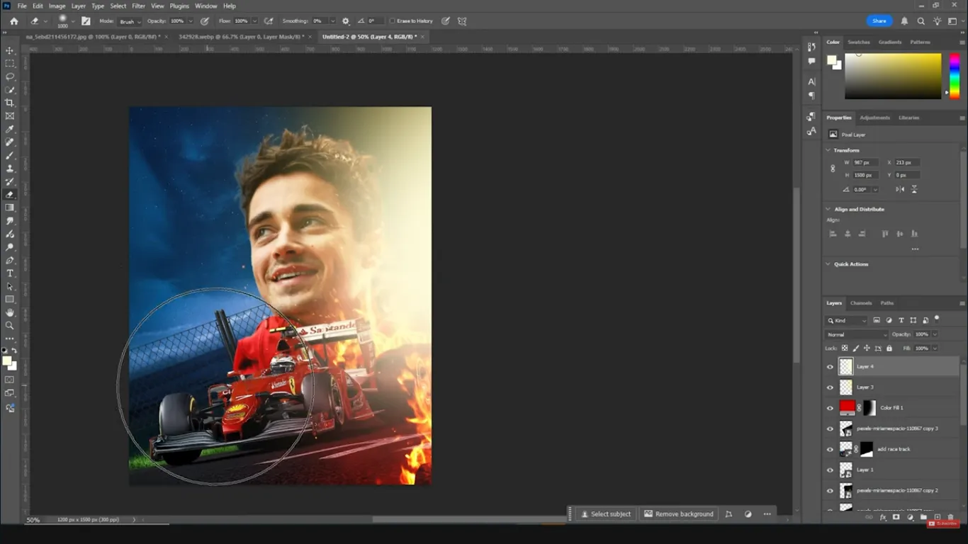
Be subtle with opacity. Dropping a fire layer to 60–80% opacity can make it feel integrated rather than pasted on.
6. Shape Light with Glows and Highlights
With flames and a dramatic sky in place, you’ll start sculpting the light around your subject and environment.
Global color wash
• Add a Solid Color adjustment layer above everything.
• Pick a deep, warm red or maroon tone.
• Change its blend mode to Soft Light.
This creates a uniform color wash that pushes the entire composite toward a cohesive mood. Add a Layer Mask and paint with a soft black brush over areas like the face and key details to keep them from becoming too dark or muddy.
Local highlights on the athlete
Next, you’ll enhance the light on the player to match the surrounding flames.
• Add an Exposure adjustment layer above the athlete.
• Increase Exposure until the highlights stand out, then mask out most of the effect.
• With a soft white brush on the mask, paint the effect back onto areas naturally facing the fire: cheeks, nose bridge, arms, shoulders, and jersey edges.
To refine the glow:
• Create a new blank layer on top.
• Select a warm orange or yellow color sampled from the flames.
• Use a large, soft brush at low opacity (20–40%) and gently paint glows near the flames and around the player’s face.
Add another layer with a slightly lighter, more yellow tone and paint smaller, tighter highlights where fire would be brightest—such as edges of clothing or equipment.
If the glow feels heavy, use Eraser or a soft black brush on the layer mask to remove excess paint and keep the effect controlled.
7. Apply Color Grading with LUTs and Adjustment Layers
At this point, your composition is structured, but it may not yet have that polished, cinematic look. Color grading ties everything together.
Add a LUT for the overall mood
• Add a Color Lookup adjustment layer.
• Load a LUT that enhances warmth, contrast, and cinematic tones. You can use a custom LUT or one from a LUT pack designed for sports and action looks.
Dial down the LUT’s opacity if the effect is too strong. The LUT should unify the palette, not completely overpower it.
Fine-tune with Camera Raw Filter
For an extra level of control, merge everything to a new layer while preserving your stack.
• With your topmost layer selected, press Ctrl + Shift + Alt + E. This creates a stamped “composite” layer of everything visible.
• Convert this new layer to a Smart Object so the filter stays editable.
• Go to Filter → Camera Raw Filter.
Inside Camera Raw, focus on:
• Highlights and Shadows: Slightly lower Highlights, raise Shadows for better detail, then adjust Contrast to taste.
• Clarity: Increase it to add edge contrast and punch to the subject and flames.
• Texture: Add a bit to enhance fabric details, skin, and sparks.
• Vibrance and Saturation: Boost Vibrance first, then add a touch of Saturation if needed so reds and oranges pop without looking radioactive.
• HSL adjustments:
• Push Reds slightly toward deeper red or orange to keep fire tones rich.
• Enhance Yellows if you want more warmth in highlights.
• Shift Greens and Aquas toward cooler blues and adjust saturation to balance any background skies or uniforms.
• Grain: A subtle amount of grain can make the composite feel more like a unified photo and less like a digital collage.
Click OK to apply the Camera Raw adjustments. If needed, reduce the composite layer’s opacity or mask out areas where the effect is too strong.
8. Add Motion Blur for Extra Intensity
To emphasize movement, you can add motion blur that affects the environment more than the subject.
• With your composite Smart Object selected, go to Filter → Blur → Motion Blur.
• Choose an angle that follows the direction of the action (often horizontal or slightly diagonal).
• Increase the distance until you see visible streaks in the background, but avoid turning the whole image into a smear.
Add a Layer Mask to this blurred layer and use a soft black brush to remove blur from the athlete’s face and key details. The result should be:
• Background and edges slightly streaked.
• Athlete’s core features sharp and in focus.
If desired, you can stamp another composite, run a second Camera Raw pass for final micro-adjustments, and keep this as your “master look” layer.
9. Optional Overlays and Typography
At this stage, the design is already strong, but you can push it a bit further with overlays and type.
Overlays
• Add subtle textures like light leaks, embers, or dust.
• Place them at the top of the stack, set blend mode to Soft Light or Screen, and reduce opacity.
• Mask out areas where the overlay competes with important details.
Typography
Choose a strong, condensed sans-serif typeface for titles like “HEAT,” “GAME DAY,” or the athlete’s name.
• Keep text minimal and legible.
• Use colors sampled from the flames or highlights so typography feels integrated.
• Add layer styles like Outer Glow or Gradient Overlay sparingly to echo the fiery mood without going full 90s poster.
Pros, Cons, and Risks of the Fiery Sports Poster Style
This style is extremely popular for good reason, but it comes with trade-offs you should manage consciously.
Pros
• High visual impact that stands out instantly on social feeds and posters.
• Flexible workflow: once you build one composition, you can swap subjects, change LUTs, and adjust colors to create a full campaign.
• Non-destructive editing means you can re-open the PSD later and adapt it for new seasons or events.
Cons
• Time investment: cutting out subjects, masking fire, and fine-tuning grading can be time-consuming when you’re new to the process.
• Over-editing risk: it’s easy to push clarity, saturation, and fire effects too far, resulting in a noisy, artificial look.
Risks and how to manage them
• Copyright issues: Always use legal sources for skies, flames, and textures (licensed stock, your own photos, or assets with clear usage rights).
• Print vs. screen mismatch: Fire-heavy posters can look darker or more saturated in print. Test-print a small section and adjust brightness and contrast if necessary.
• Legibility: Fire and motion blur can make small text hard to read. Keep key information on relatively clean areas of the background.
Mini Case Study: A Game-Day Poster for a Local Team
Imagine you’re designing a poster for a local basketball team ahead of a high-stakes home game. The creative brief: “Make it feel like the court is on fire and the players are unstoppable.”
Here’s how you could adapt the workflow:
• Use a full-body action shot of the star player driving to the basket as your hero subject.
• Replace the track with a hardwood court photo, but keep the same concept of perspective and depth.
• Swap out the sky for a darkened arena background with subtle crowd silhouettes and stadium lights.
• Place fire overlays along the court lines and around the player’s shoes to suggest friction and speed.
• Use LUTs and Camera Raw to push the palette toward team colors—maybe deep reds and golds—while keeping skin tones natural.
• Add bold typography at the top: the team name and “HEAT NIGHT” or “PLAYOFF FIRE,” with game details at the bottom edge.
With one well-built master file, you can then:
• Replace the subject for each key player.
• Keep the same background and fire, but tweak color grading so each version feels slightly unique.
• Export optimized files for social media, digital posters, and limited print runs.
This kind of scalable workflow is where Photoshop composites really shine: one core design, many variations.
Common Mistakes and Expert Fixes
Even experienced designers run into pitfalls with this style. Here are some frequent mistakes and how to solve them quickly.
• Light direction doesn’t match the flames
If your fire glows from the left but your highlights are painted on the right side of the athlete, the brain notices something is off—even if the viewer can’t explain why. Always check where your brightest light sources appear in the frame and align your highlights, glows, and shadows accordingly.
• Over-saturated reds and oranges
When everything is turned up to 11, the image becomes fatiguing. Watch for clipped reds (pure red without detail) and dial back Saturation in Camera Raw if the jersey or skin starts to look neon.
• Subject looks pasted on
A common giveaway is when the subject’s edges are too sharp compared to the rest of the scene. Use subtle Gaussian blur on the farthest edges or add a bit of grain to the entire composite to unify texture. Also, paint glows that overlap edges slightly so the flames and subject interact.
• Too much motion blur
Motion blur should enhance movement, not erase detail. If you apply blur to the entire frame, mask it heavily around the face and torso so the viewer always has a crisp focal point.
• Messy layer organization
Complex composites can have dozens of layers. Rename key layers (Subject, Fire_Front, Fire_Back, Sky, LUT_Grade, etc.) and group them. This saves time and makes it easier to create variations later.
FAQ: Sports Poster Design in Photoshop
Conclusion: Turn Up the Heat in Your Next Design
A powerful sports poster isn’t just a cool background with a player dropped on top. It’s a carefully constructed composite where environment, effects, and color grading all support the athlete’s energy and story. By planning your concept, working non-destructively, and layering in fire, glows, LUTs, and motion blur with intention, you can create posters that look ready for pro-level campaigns.
Your next step is simple: choose a strong athlete photo, gather a dramatic sky, some fire overlays, and open Photoshop. Follow the process in this guide once from start to finish. Save your file as a reusable template, experiment with different LUTs and color schemes, and you’ll quickly build a library of fiery, cinematic posters that showcase your creative range—and get real-world attention from teams, brands, and fans.
Design your next fiery sports poster in Photoshop